Overview
The community health dashboard was my first project at Esri! I was tasked with polishing a custom Svelte framework web app for a state government. This dashboard helps the department track and work towards certain priorities and goals to ensure the health, equity, and wellbeing of the state's citizens. My contribution was making UI changes to the site, as well as updating the print style sheet to make the web app readable and accessible in a paper format.
"Smallifying" UI
Tweaking the UI to be smaller, or as Lillie dubbed it, “Smallifying the UI” meant shrinking down the interface vertically with respect to spacing, font size, and component size. A lot of my time was spent meticulously cross referencing the web app with the design mockup to ensure they matched, from element spacings and dimensions to font colors, weights, and sizes. The dashboard was designed through Figma, an online design tool I had extensive experience with before my internship, which helped ease along the process. The bulk of translating the Figma prototype into the working web app was frontiered by others before my internship started. After fine tuning the UI, this was my result:
(the following has been modified to protect proprietary client information)
(the following has been modified to protect proprietary client information)
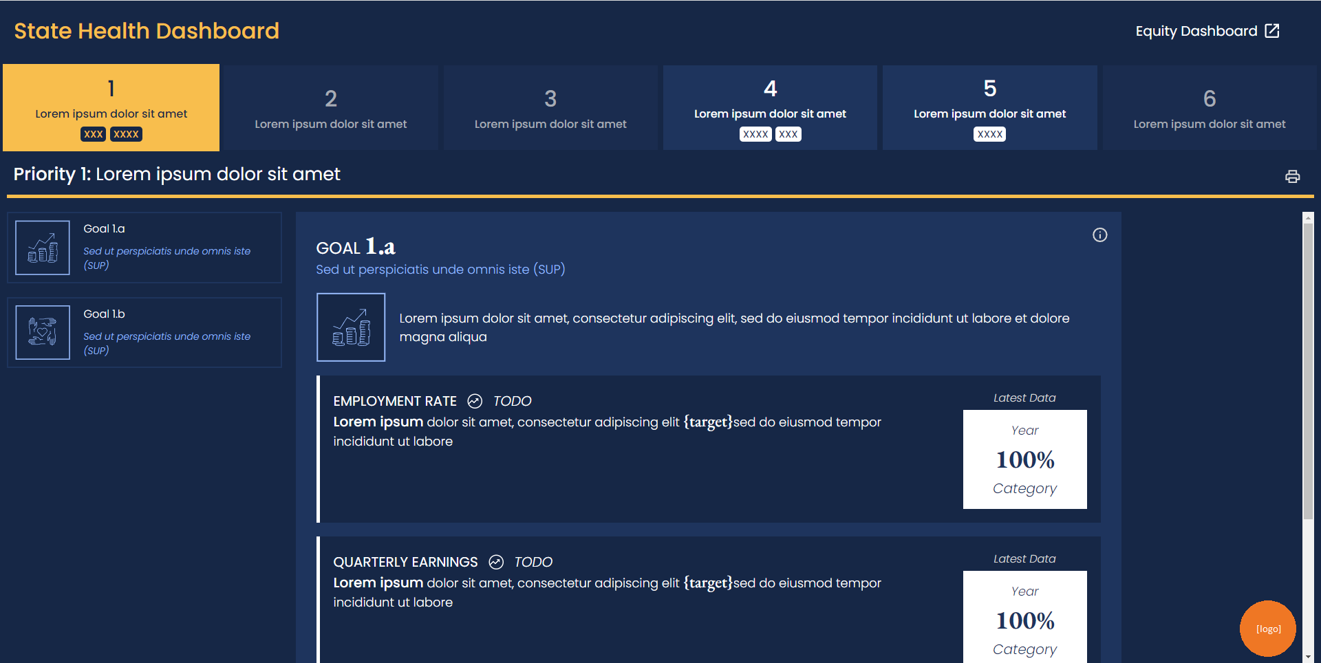
Main branch before "smallify" changes
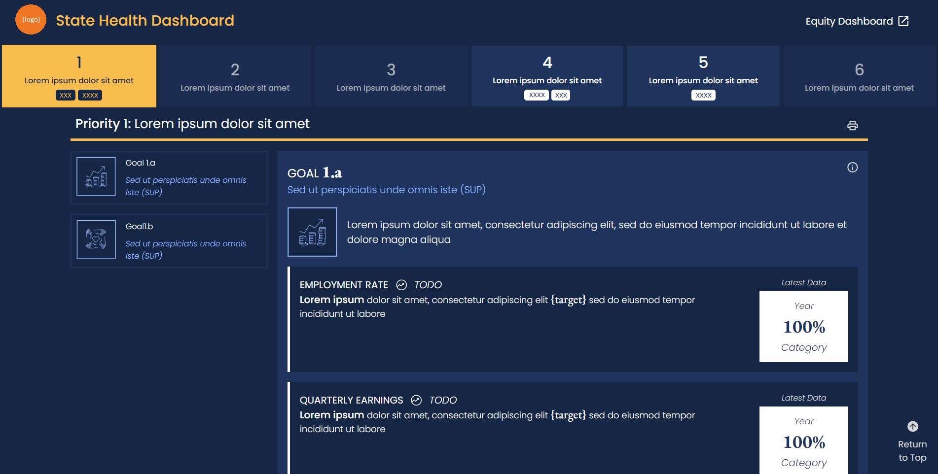
Main branch after "smallify" changes
Changes highlighted:
✤ Smaller heading
✤ Smaller navigation bar
✤ Smaller SP heading
✤ Smaller Impact Goals sidebar
✤ General font shrinkage
✤ Edited tile layout & dimensions
✤ Gap of space added between IG description & tile
✤ Scrollable section stretches across entire width of page
✤ Smaller heading
✤ Smaller navigation bar
✤ Smaller SP heading
✤ Smaller Impact Goals sidebar
✤ General font shrinkage
✤ Edited tile layout & dimensions
✤ Gap of space added between IG description & tile
✤ Scrollable section stretches across entire width of page
Print Style Sheet
My next major task for the dashboard was to create the Print Styling Sheet for the dashboards. When you print a page, your browser automatically generates a print layout for the page, with varying degrees of readability. Reformatting the print sheet meant thinking about all the nuances that went into to translating an interactive webpage into a tangible print. This was a bit of a unique task since my team had limited experience with Print Style Sheets. Since I was mostly on my own, I began making a research document of best practices and began development from there:
(the following has been modified to protect proprietary client information)
(the following has been modified to protect proprietary client information)
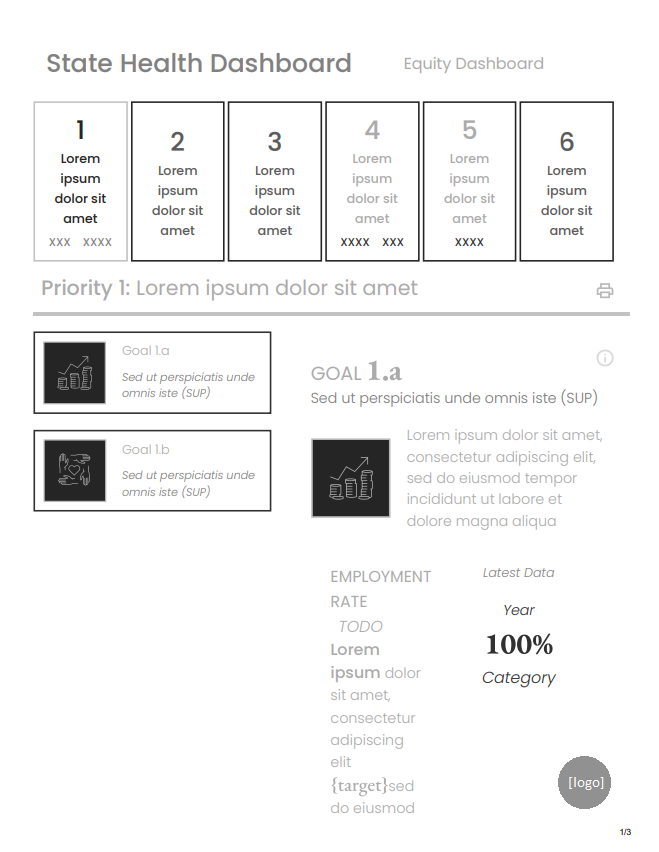
Before
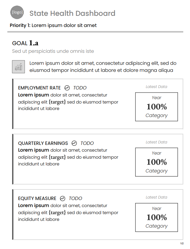
After
Changes highlighted:
✤ Different styles for black & white and color
✤ Different styles for portrait & landscape modes
✿ Print style sheet prioritizes portrait & black and white
✤ Adding text contrast (grey text ⇒ black text)
✤ Removed navigation bars
✿ SPNav only shows current SP on page
✿ IG Nav is removed entirely
✤ Removed “CalHHS Equity Dashboard” link
✤ Added appropriate page breaks to Objective Cards (shouldn't be split in the middle)
✤ Removed extraneous buttons (print button, jump to top button)
Unique Challenges
Svelte packages HTML, CSS, and JavaScript into one framework. I had some prior experience working with HTML, CSS, and JS, so understanding how Svelte wired them all together took a bit of time to fully understand. After working on this project, I became really comfortable with Svelte and even chose it as my development framework for the Intern Hackathon later on in the internship (and for this Intern Blog!)
Regarding the print style sheet, it's important to understand that people interact with paper and digital interfaces very differently. For example, I had to remove any extraneous buttons or links that would render obsolete on paper and convert a “dark mode” web app into a “light mode” print sheet to conserve ink. On the web app, the navigation bar toggled between different impact goals which display on the page one at a time—this presented a challenge since the print layout requires all information to be laid out at once. I decided it was best to remove the Strategic Priority Goals navigation bar, since it didn't have function on paper and took up a lot of space. For the Impact Goals navigation bar, I removed it and worked in coordination with another team member to display all the goals at a time in lieu of toggling a navigation bar. A final challenge of designing a print style sheet is that you can't open it in the browser and inspect elements. This was a bit of barrier in fully understanding the layout, but frequent checks and intuition helped me deliver the final design phase.
Working alongside the exceedingly impressive and creative Lillie made working on this task extremely rewarding. Whether it was answering a small question, or even going classroom mode and pulling out a whiteboard to give a CSS class application crash course, I always felt supported throughout the project. Special thanks to Lillie Bahrami!