Overview
User Conference is the largest GIS Conference in the world, celebrating the future of GIS and current achievements. This year, I was able to attend three virtual sessions: the Plenary on opening day hosted by Esri CEO Jack Dangermond, an Arcade mapping and visualization workshop, and a cartography workshop. I will delve into my favorite panel, the cartography workshop.
Mapping Wizardry
“Mappy Wizardry” hosted by
Kenneth Field
was unquestionably my favorite virtual panel. This session aimed to “demonstrate the cartographic power and flexibility of ArcGIS,” which piqued my interests in both technology and design. One demonstration showed an alternate way to map election data:
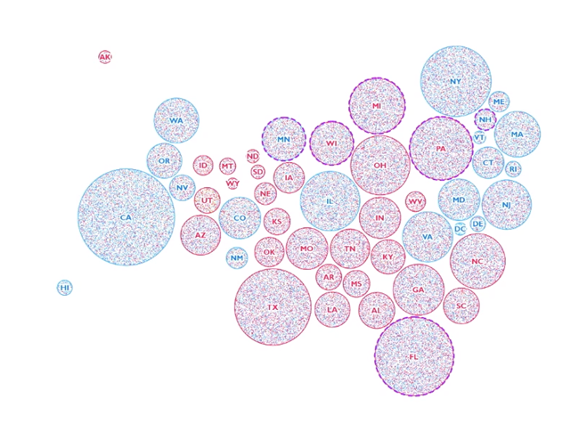
The goal of this map was to better reflect votes with regards to physical area. This takes state population into account, standardizes the shape representation of states, and breaks down winning results into areas within the state. From here, you can observe that most states are actually “purple” which is information you couldn’t glean off a typical election results map.
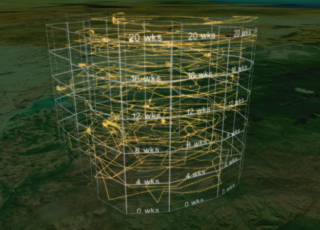
Another map I found interesting about this session was the tiger boundaries. This map, called a “space-time cube,” translates data into the z-axis to create a 3-dimensional representation of the data. An observer can look at cross-sections in this graph, especially in the boundaries, to view where a tiger was at a particular location throughout the timeframe recorded.
I found it incredible that such sophisticated, diverse maps can be created in ArcGIS Pro. Data by itself contains insights that are difficult to understand from looking at raw tables; it is the way the data is presented that is integral to our understanding and the conclusions we may draw. The ability to accurately, clearly, and concisely represent data in a way that best communicates the purpose and structure of the data is a skill I would like to advance throughout my professional career.