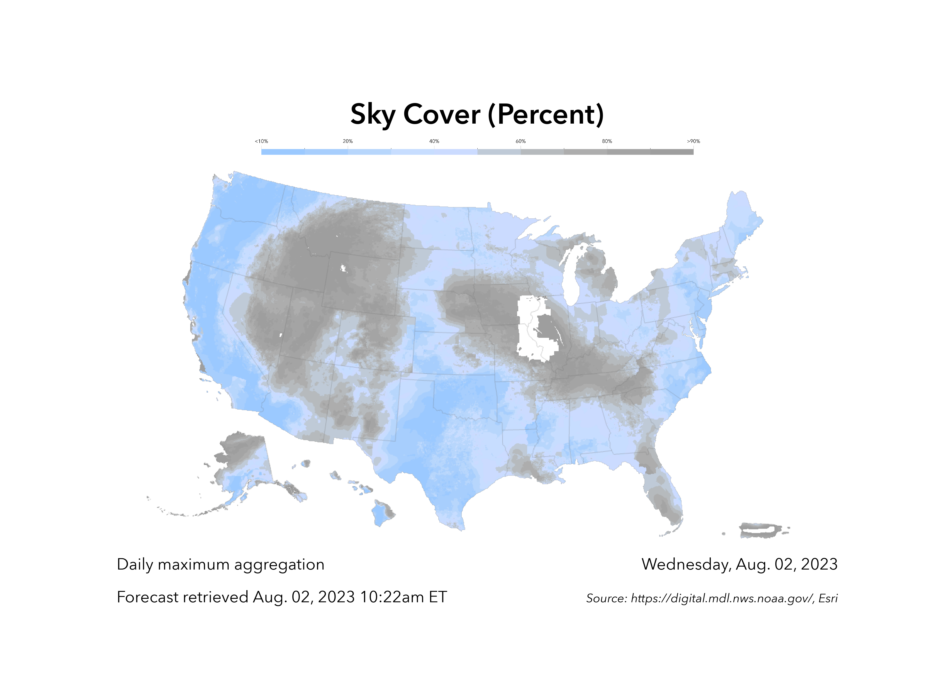
Overview
This was one of my shorter projects, but definitely one of my favorites for the summer! I was tasked with creating a formatted and labeled map graphic to be used in weather reports by the Washington Post. This involved parsing through JSON files for date, forecast, and unit formation, and pulling in fellow intern Peter LeCavalier’s code as an external module to generate the map legend. After I had collected and formatted the graphic components, I used matplotlib.pyplot to create the final map graphic and add in the formatted annotations and images.
Data Parsing
My main mentor for this project, Gina O’Neil, had created a mock graphic for what my script should aim to generate. She provided guidelines on where my script should draw from when pulling in map data:
I structured my script to loop through each map type, and then each forecast day within each map type. With the known map type, or directory (dir), it would search into a JSON log file “*_image_processing_log” with the corresponding directory name. From there it would grab the map graphic title, units, source, forecast retrieval date (timestamp), and date (weekday). From there, I formatted accordingly:
✤ title_string ⇒ title_string([units_formatted])
✤ units ⇒ units_formatted (Ex: “Degrees C” ⇒ “°C”)
✤ forecast_date ["YYYYMMDD_XXXX[AM/PM]"]/[“XXXX[AM/PM]”] ⇒ Month. Day, Year XXXX[am/pm] ET
✤ date ["YYYYMMDD_XXXX[AM/PM]"]/[“XXXX[AM/PM]”] ⇒ Weekday, Month. Day, Year
✤ units ⇒ units_formatted (Ex: “Degrees C” ⇒ “°C”)
✤ forecast_date ["YYYYMMDD_XXXX[AM/PM]"]/[“XXXX[AM/PM]”] ⇒ Month. Day, Year XXXX[am/pm] ET
✤ date ["YYYYMMDD_XXXX[AM/PM]"]/[“XXXX[AM/PM]”] ⇒ Weekday, Month. Day, Year
The data parsing process involved importing datetime modules, creating dictionaries mapping integers to days/months, and string concatenation to output the desired format.
Generating Graphics
Once I had all the formatted strings, it was time to stich it all together into the final map graphic. I grabbed the plain map graphic and displayed it using matplotlib.pyplot.imread() and matplotlib.pyplot.imshow(). Then I added in the title, and the text annotations (forecast_date, date) which dynamically fit to the map’s corners.
To insert the legend, I had to call Peter’s colorbar.py code. I initially found myself stuck since the RBG inputs for the colorbar weren’t provided in my log files, but after talking with Gina she provided me with another log file which had the desired inputs. Before I could insert the legend and call it a day, I had to make some additional tweaks to the colorbar:
Before
After
The final step was to put everything together and output the labeled map graphics. Running my script outputs a new directory with subdirectories based on map type, each containing the labeled map series:
I’ve been focusing a lot on website development and front-end work, so a python scripting project was a nice change of pace. It made me remember how much I love automating tasks and working with data, especially when it had tangible real-world benefit (like being used by the Washington Post!!). Special thanks to Gina O’Neil, Josh Peterson, Peter LeCavalier, and Jared Kohler.